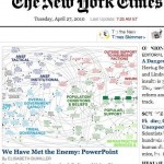
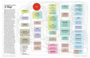
 Today’s New York Times features an article, “We Have Met the enemy and He Is PowerPoint” that became the day’s most emailed piece. It features a complex diagram designed to present the relationships that shape counterinsurgency dynamics. This isn’t even a new story: as my colleague John Sterman reminds me, it was in the news last year. John argues that the story offers a good illustration of the poverty of the mental models most people hold and suggests checking out Stephen Colbert’s quite funny piece about this, Afghandyland.
I have to say I got many messages about the NYT article myself! Why the interest? In my circle, it’s partly because the author conflates the complexity of a causal loop diagram designed to capture a full spectrum of COIN, or counterinsurgency, policies and dynamics with the use of powerpoint. I’m happy to critique powerpoint–in fact, it’s been a bit of a theme for me these past five years–but I also don’t want to unfairly blame the medium for problems in presenting dynamic complexity.
First, on presentations as the method of sharing ideas and work. We are seeing how important powerpoint is everywhere, even in my students’ class projects this semester where some of our project clients want only powerpoints. The form is, clearly, here to stay, at least for the present–Tufte’s earnest injunctions notwithstanding (check out his monograph with the enticing subtitle “Pitching Out Corrupts Within”). For some useful advice, feel free to check out some great blog posts (such as this one from Lifehacker), aptly-titled books like “Death by Powerpoint,” and my favorite, Garr Reynolds. And get better at using powerpoint. Try new things, experiment, iterate, weed out what doesn’t work. Run your presentations by a “murder board” of peers or colleagues. In almost every case, you’ll need to cut slides and words, simplify diagrams, and leave off things.
The result will be slide decks that are even less self-explanatory when they stand on their own (this is something I learned from MIT’s Woodie Flowers, who argues that you need to create live interactions for learning that cannot be captured by other materials). Woodie’s powerpoints make no sense without him there.
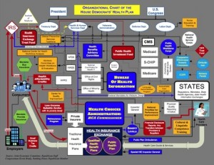
But if we are trying to pare down, simplify, and present ideas more succinctly and compellingly, we are in a quandary when we realize that powerpoint is one of the most widespread genres for sharing and recording work, at least for now. And as infographics become more influential (and fun!), we’re drawn to images over words and stories. In the debate over healthcare reform, for instance, dense diagrams are key tools, as these images show.
How to deal with the challenges of presenting dynamic complexity in ways that live on beyond the interpersonal interactions of, say, a classroom or client presentation? If the slide deck is the trail you leave behind you, how on earth do you present a system dynamics model using one? We’re beginning to see more explanatory videos (example). Is this the new method of disseminating and discussing dynamically complex ideas?
I don’t think that there are simple answers. Embedding models in decks may be one solution. Presenting the model carefully and part-by-part may be another. Take a look at others’ presentation decks, and borrow what works. Put your documentation in hidden slides or appendices. Or post more detailed material online and place the url on every slide.
If your material is online, that’s another story, as it’s getting easier to post hosted models that can be simulated using java. People are experimenting with online interactive diagrams: see this one on obesity. But can such a complex set of loops and relationships stand on its own?
Any other suggestions?


